Fun with CSS3
Alongside HTML and JS, CSS is a core component of the modern web. CSS defines the look and feel of web markup - positioning, colors, fonts, margins, padding, etc.
CSS3 is the latest, greatest edition of CSS, coming to us alongside HTML5. With it, it brings LOTS of new behaviors, tricks, etc. In my past two mini-projects, I explored some of the edge case capabilities of CSS3.
The first project, "Lichtenstein", aimed to fuse the Pop Art styling of Roy Lictenstein with the highly interactive, dynamic web.
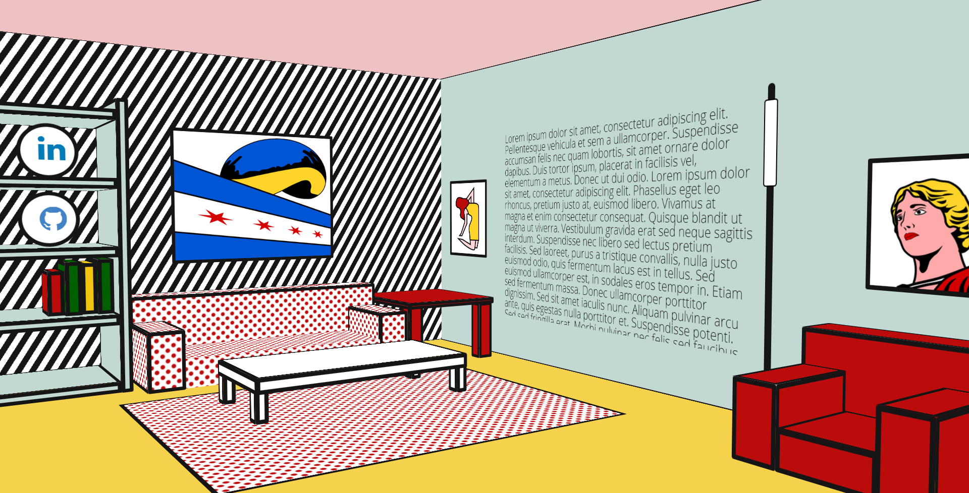
I first encountered Lichtenstein and Pop Art during my first stint through Europe. While exploring the Tate Modern London, England, I encountered his work "Whaaam", and immediately loved it. Ever a fan of minmalism, his comic strip inspired artwork appealed to my love for simplicity.
Attempting to produce some "Pop Art" of my own, I began by goofing off with backgroud-image rules: building gradients, polka dots, stripes, etc. With CSS3, linear and radial gradients can be easily applied to elements without the need for images. For example, the code below produces the red polka dots, steryotypical of comic strips and Roy's art.
background-image: radial-gradient(#bb0c0c 20%, transparent 35%), radial-gradient(#bb0c0c 20%, transparent 35%)
Next, I needed to make some funky shapes - triangles, trapezoids, etc. These shapes are usually accomplished in web using transparent border tricks. Unfortunately, these borders cannot inherit the background-image styling from the rest of the element.
Instead, I turned to tridiv, an AMAZING resource for building advanced scenes in HTML5 without resorting to <canvas/> elements. After building a rough scene, I imported the produced HTML and CSS into my project. I spent A LOT of time tweaking, organizing and optimizing this code until it fit my needs.
Next, I added some JS atop the scene to transform the perspective, giving it a drastically more "alive" feeling; mixed in the background CSS and adjusted colors; and finally pumped out some simple vector graphics for flair. The final product is one that I'm very proud of.
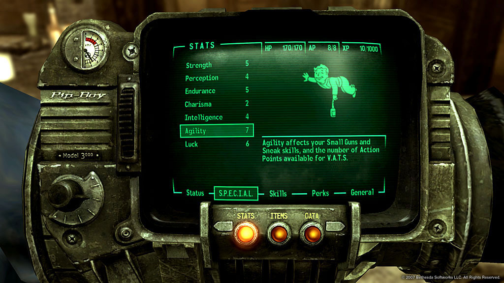
The second project, "Pipboy", mimiced the game tech of the Fallout series from which it gets it's namesake.
Like the Lichtenstein project, this one also utilized the new background-image options from CSS3. These played a critical role in the most prominent feature of the project - the scan-lines. These lines can be built with the following code:
background-image: repeating-linear-gradient(90deg, #010a01 0, #022608 0.5em, #010a01 1em)
To make the scan-lines feel more like a retro CRT monitor, CSS animations were added in. Like CSS transitions, CSS animations allow the page style to animate and change over time and with user interactions. Transitions work using "easing" - using math to gradually adjust a style property from one value to another. In animations, we can set many "stops" along these gradients via key-frames. For more information, checkout this post, which makes a great breakdown of CSS animations.
The transition built here, involved moving the scan-lines up / down. Because we build the lines with background-image, this was almost trivial top implement; just by manipulating the background-position property.
After the lines were built, the rest of the project came together easily. Unlike the Lichtenstein project, which required a lot of time designing and envisioning, the pipboy had a very clear end product to hit. With such a very rigid model to follow, most of my time was spent plain-old coding. It was easy to use personal data for the content; eventually becoming a pseudo-resume on its own. Again, this is a project I'm really proud of.